Building Global Website Experiences at Stanley Black & Decker
Case Study | 2020-2022
Liz Hunt
Baltimore, MD
lizhuntdesign.com
lizhuntdesign@gmail.com
Accessibility Design System Research Strategy Management Operations
Team
- Joseph Carter-Brown, Global UX Manager
- Liz Hunt, Senior UX Designer & Manager ← Me
- Matt G., Lead UX Engineer
- Michael M., Lead Accessibility Designer
- Erin G., UX Designer
- Thomas C., UX Strategist (2020-2021)
- Chris F., UX Researcher (2021)
- Paulina D., UX Research Strategist (2022)
Background
By the summer of 2020, a three year rollout plan to replatform all Stanley Black & Decker brand marketing websites was in it's final approval stages.
The vision was to sunset outdated and disparate processes in favor of more streamlined and centralized systems of record. Content would be housed in modern Product Information Management (PIM) and Digital Asset Management (DAM) architectures. Third-party services and outside vendors would be audited and paired down. Organizational walls would be bulldozed to foster better cross-functional collaboration. It was a global-first approach unlike anything the company had done before
As a freshly formed Global UX team, our mission was to drive the research, strategy, and design for this ambitious program.
Getting Started
Under direction of the Global UX Manager, I was tapped to lead our team in this work. My role was as air traffic controller, herding our expertise to form a cohesive operational strategy and deliver a unified vision.
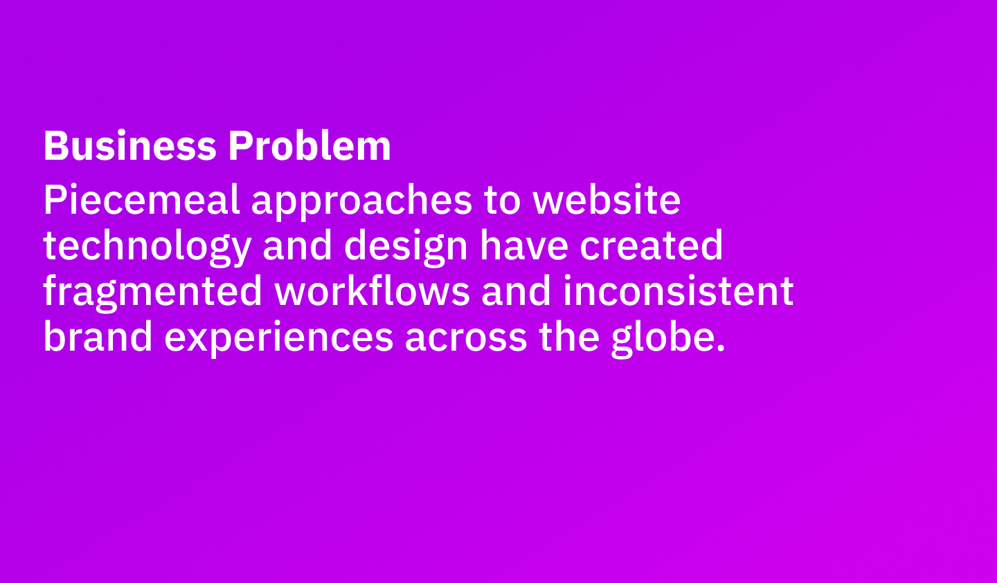
Our first challenge was defining and assessing the larger problem. From our inital understanding, the organizational goals of streamlining and centralizing were motivated by internal business needs. But what about the external needs of our end users? How would they benefit (or not) from these structural changes to our websites?
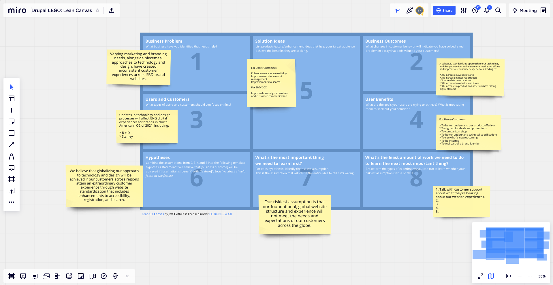
To help us form a coherent problem statement, I used tools like Jeff Gothelf's Lean UX Canvas. This helped us construct a list of hypotheses and gave us a bird's eye view of the work ahead.
Conducting Usability Evaluations
Armed with a list of questions, our next big task was learning from people who used our websites.
Previous research from the consumer insights team told us that people visited our websites for three key reasons:
- To evaluate products
- To find services and support
- To select a path-to-purchase*
*At the time of this case study, most Stanley Black & Decker websites did not sell direct-to-consumer.
With oversight from our UX Researcher, we planned, coordinated, and conducted a low-cost usability study with over twenty people across North America, focusing on the company's top brands: Black+Decker, Craftsman, and DEWALT.
After observing and capturing exhaustive notes of each participant evaluation, we synthesized our findings in Miro through several workshops facilitated by our Global UX Manager.
I then took what we learned from this research to form the operational strategy and tactical approach of the program work ahead.
Crafting an Accessibile Design System
In order to move at the speed required to support an aggressive website deployment schedule, our biggest challenge was to create, refine, and govern a unified design language for a global catalog of online brand experiences.
To that end, in parallel to our research efforts, the Global UX team began to carefully define and construct a new design system. This was an artifact that had not existed at this scale before in the company's long history.
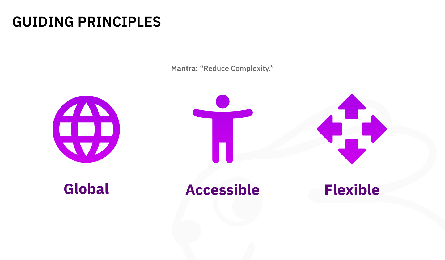
A previous website project for the Craftsman brand acted as the starting point for our system's structure, but we needed to feel more confident that our mantra of 'reducing complexity' would apply to all brands across the globe.
To tackle this uncertainty, I led direct reports in an audit of current brand marketing websites across regions to assess which structures were unique and which were similar. This exercise helped us align design system structure with business requirements and end-user needs.
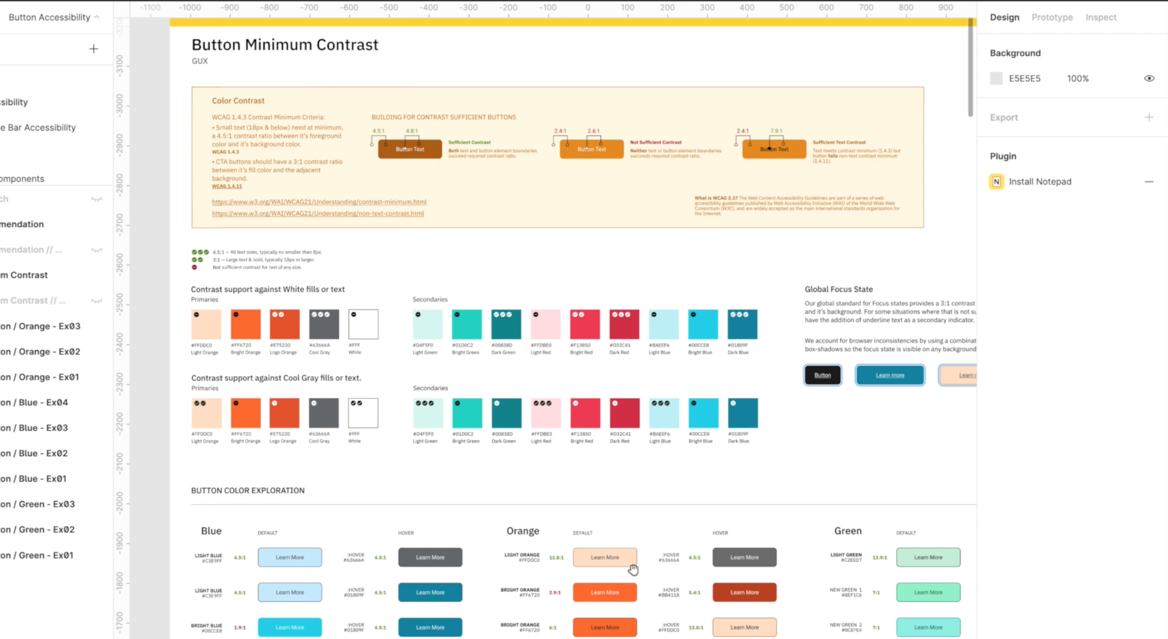
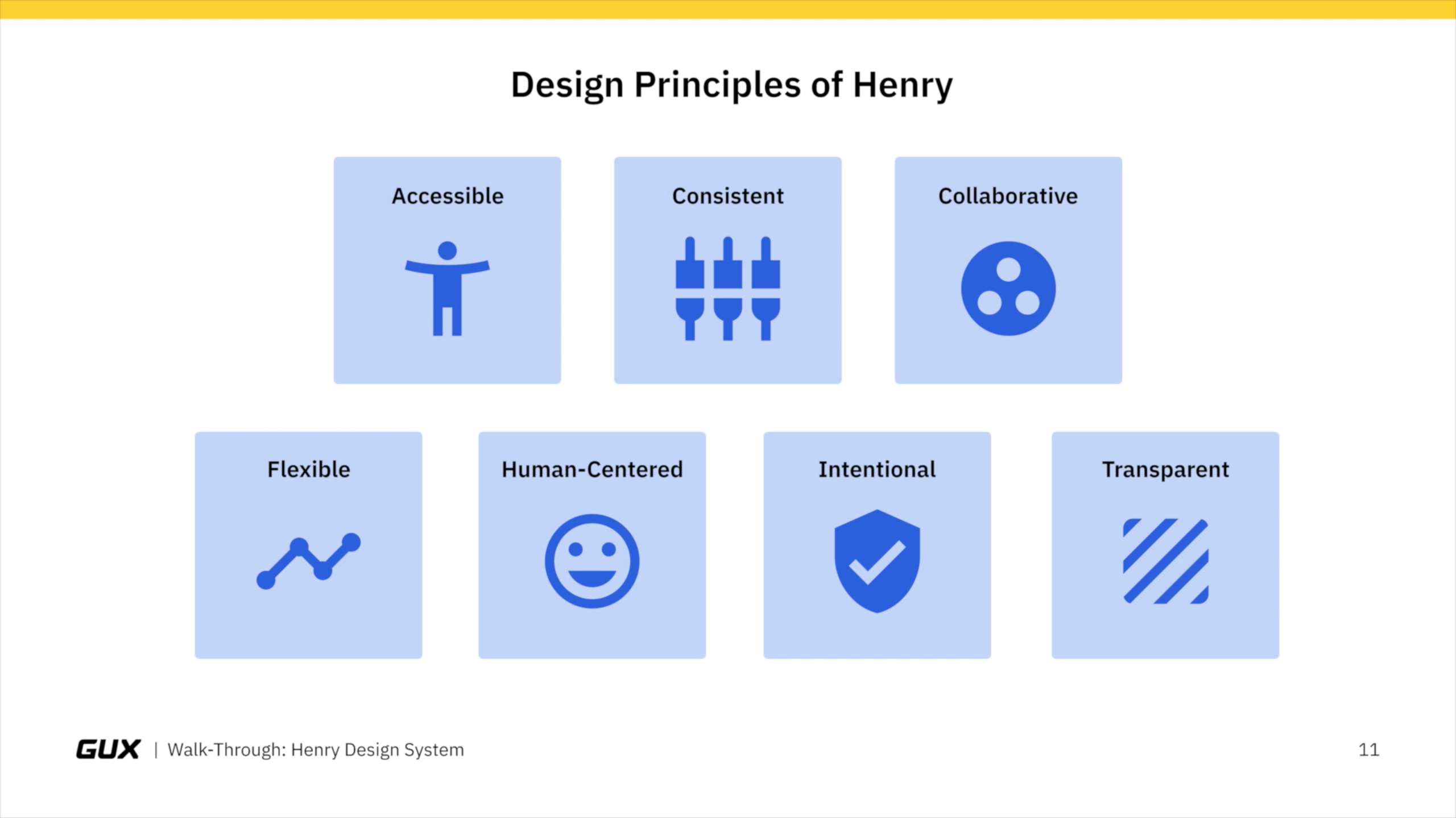
After the basics of our system came into focus, our next consideration was accessibility. Compliance with ADA and the Web Content Accessibility Guidelines (WCAG) was a key initiative for Stanley Black & Decker's marketing organization and the website program was seen as the main vehicle for improving our standing.
After additional budget was secured, and with guidance from outside partners and our own Lead Accessibility Designer, the design system was pressure tested for Level AA and AAA compliance. Areas we focused on specifically included color contrast ratios, tab order for keyboard navigation, input feedback, and content accessibility.
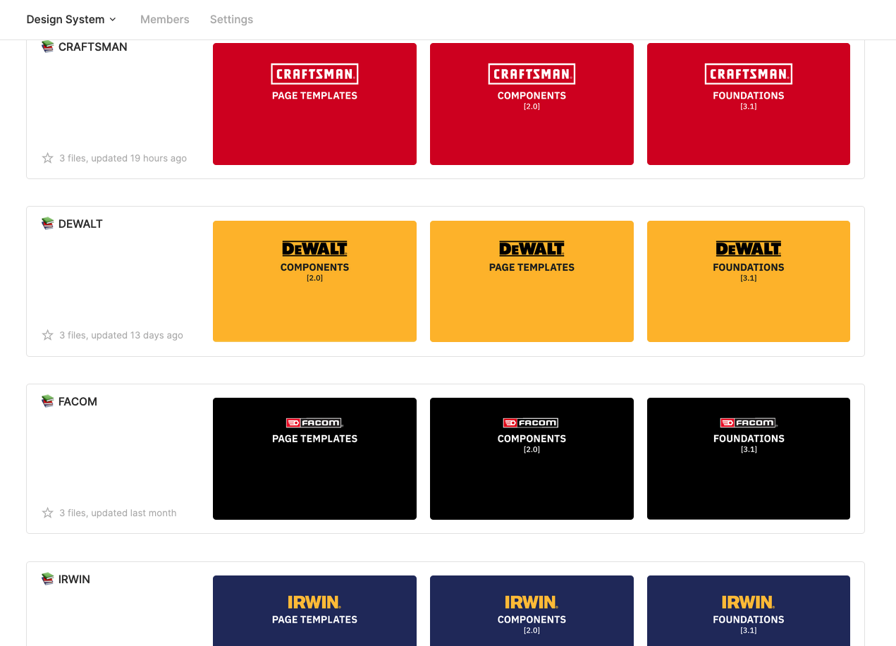
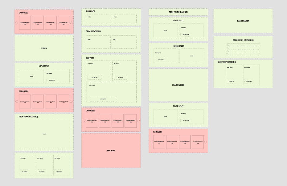
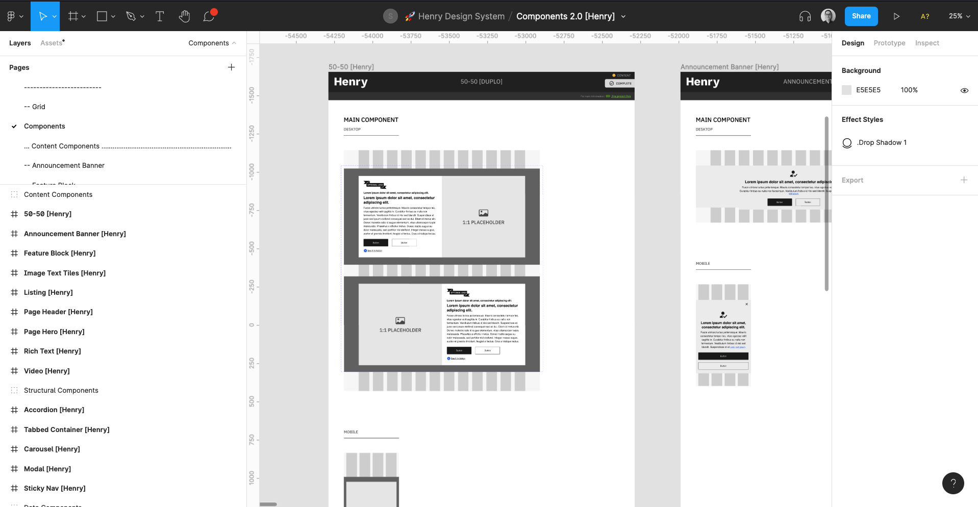
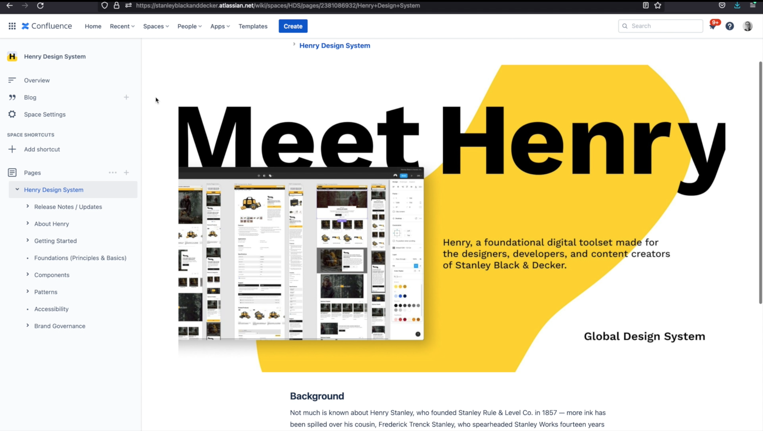
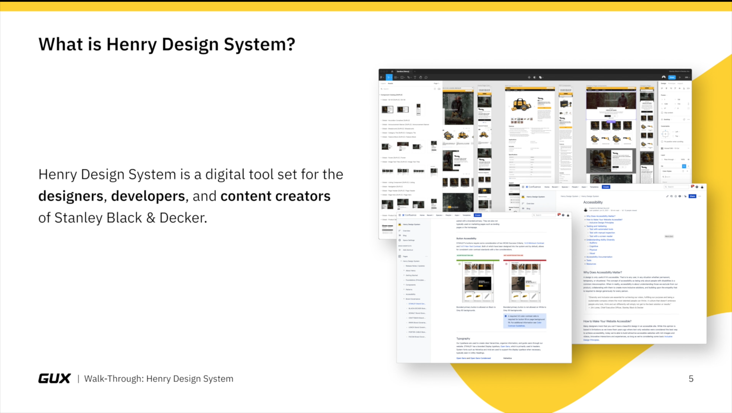
After a year of dedicated effort, the Global UX team delivered a core design system that was created and housed in Figma. We called the system Henry after an original company founder.
Structurally, Henry was broken into three parts:
- Foundations — Defining global elements like grid, spacing, button, and form interactions, as well as brand specific design considerations like typography and color palette
- Components — a catalog of reusable building blocks like Page Heroes, Carousels, Videos, and more
- Page Templates — common patterns of components like Home pages, Landing pages, Support pages, and more
This structure enabled us to build websites that are global, accessible, and flexible.
Documenting & Evangelizing Our Work
With a design system established, our next challenge was to ensure proper documentation and governance of design and development best practices.
I worked closely with the team to create and maintain documentation resources in Confluence, ensuring we considered the needs of designers, developers, and content creators.
This documentation was continuously updated and expanded as we learned more and the requirements around the new website platform solidified.
Once we established some initial resources, it was clear Henry was ready for a company-wide debut. I led and produced a high-level video walk-through to share on Workplace, an important hub for company communications. Through this video, I showcased the strides the Global UX team made for the future of Stanley Black & Decker web experiences.
Planning & Delivering People-Focused Features
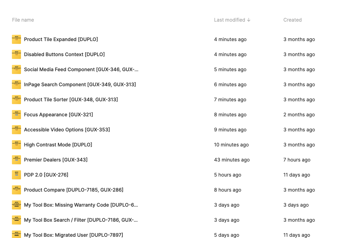
Overlapping our documentation work, I wanted to establish an operational process for the research and design of new website features that our team would own.
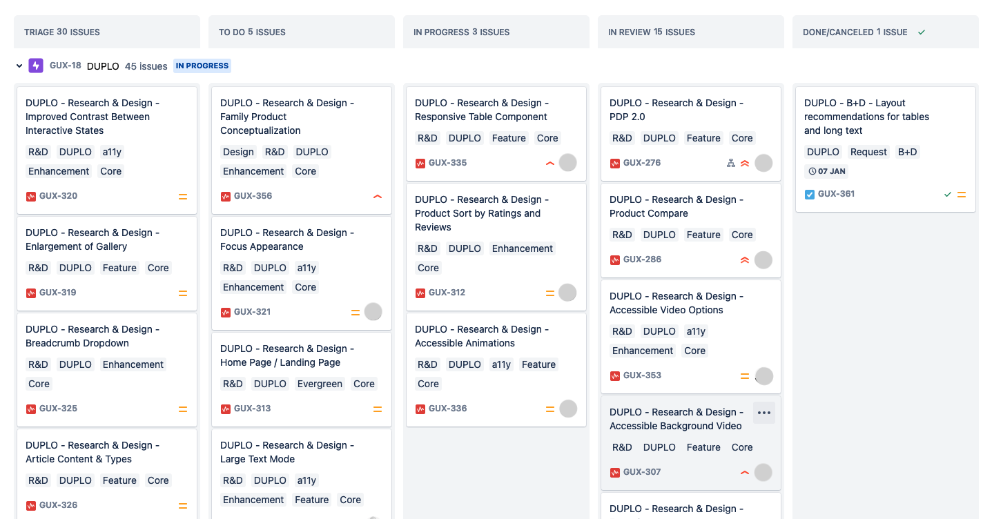
The usability evaluations from the previous year continued to provide rich context for potential areas of focus. I used this alongside a feature 'wishlist' from business, brand, and IT teams to build out a Jira board of Global UX team priorities for the program.
The goal of this board was not only to hold ourselves accountable to the work, but to bring our cross-functional partners along for the ride.
I worked closely with product and business owners to verify our pipeline and keep our efforts several weeks ahead of development sprints. My goal was to ensure the concepts we proposed had a high percentage of confidence from the team, backed by just-enough internal and external research to move forward.
Lessons Learned
In January of 2022, due to inflation and budgetary constraints related to the pandemic, our work was cut short by a reduction in force. The Global UX team was effectively laid off. What we accomplished in our time together, however, was significant.
This experience represented many firsts in my career: first management role, first global team, first cohort with dedicated expertise.
Looking back, here are some key lessons I learned:
- Design systems are living, breathing organisms that need dedicated caretakers. Continuous management and maintainance of a design system is a full-time job. Driving system adoption and buy-in from cross-functional teams ensures these labors of love thrive well beyond design teams.
- Anchoring UX work to well-defined outcomes is vital to success. Defining KPIs and KSAs is something our team worked hard to drive but ultimately struggled to do in a way that connected meaningfully with leadership. Learning how to do this effectively continues to be an opportunity area for me and my professional journey.
- Considering global needs is critically hard work. This was a challenge the Global UX team—all based in the U.S.—was keenly aware of. With the guidance of global partners, we were able to see some of our most glaring blind spots. Considering cross-cultural needs, however, continued to be a pressing opportunity in our work.
- UX work doesn't progress linearly. This is a reality that took years to accept and embrace. Layering UX work—particularly research and design—is crucial to executing a shared vision teams can be proud of.
- Managing people and managing processes are not the same. I had the opportunity to perform both roles during my time with the Global UX team. I found joy and challenges in each as I learned the distinctions.
What hits hardest when reflecting on my time with this team is that it uncovered the core reason why I love doing this work: for the immense honor and privilege of creating something with people who care.
Looking for additional examples of my work? View this 2017 case study. Interested in working together? Send me an email, I'd love to hear from you!